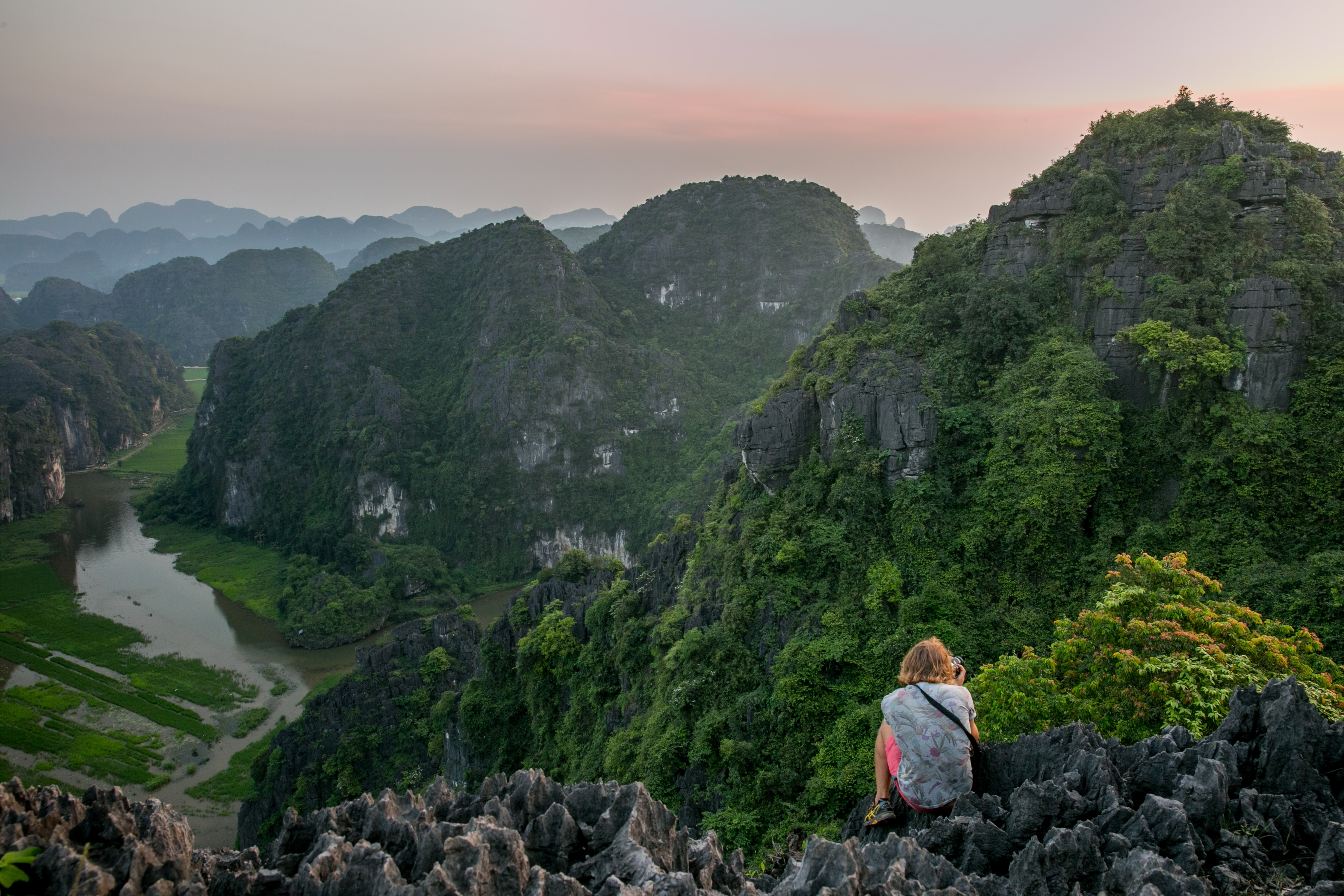
More Reasons Why Shooting in RAW is Good
Have you ever tried to increase the saturation to a JPEG, but increased it too much and got some color distortion in the areas that you were trying to enhance? Because of the extra data that exists in RAW, you can enhance the saturation levels much better in RAW than in a JPEG. Just another reason shooting RAW is a good idea. Today we’re going to talk about the Vibrance and Saturation sliders and how they differ. I will very often add increased saturation/vibrance to my photos, even if just a little bit. When not adding saturation/vibrance maybe I’ll decrease the levels instead. I find that I’m using the Vibrance slider much more often than the Saturation slider these days. So what’s the difference?
The Details
If you are working in Photoshop Elements, like me, then here is a picture of the settings that we are discussing (circled in red). Other programs will have similar settings.
The Difference
In simple terms, Saturation increases the intensity of allof the colors in a photo without discrimination. If you already have some colors that are well-saturated in a photo, increasing the saturation will tend to leave those areas over-saturated and result in loss of detail. Vibrance is a smart tool that picks which colors to intensify. If you have a photo where some of the areas are already well saturated, the Vibrance tool attempts to leave those areas alone and only saturate some of the more muted colors in the photo. In theory, the Vibrance tool is also supposed to go easy on skin tones.
When to Use
If you want to bring out the intensity of colors in your photo, try using the Vibrance tool before going to Saturation. You might find that Vibrance does the trick. If not, then you can fall back on the Saturation tool. Let’s look at a before/after photo with Vibrance vs. Saturation so you can get a practical idea of how they work.
Here is a before/after photo I took recently of a woman in a Sailor Moon costume (for all you geeks out there). The after photo is an edit directly to the JPEG where I increased the saturation to 50 (randomly for effect). Notice how orange the skin looks and over-saturated in general.
Below is a before/after photo of the same thing but this time with the saturation increased to 50 in the RAW file (instead of the edits done on the JPEG). The skin tone is much better with the edits in RAW. But notice how much detail is lost in the red bow after saturation.
The last before/after view (below) shows the vibrance increased to 50 (saturation at 0). The skin tone is much closer to the original here. The red bow has only been minimally saturated, keeping all of the detail in the wrinkles. The largest adjustments came in the color of the hair (more yellow) and the blue skirt (taking out some of the shiny reflection).
Caution
As with any edit, it is possible to go too far. Don’t go crazy with too much saturation or vibrance. I see over-saturation all the time in photos, and I have to admit, sometimes I get a little too carried away. When in doubt, take a break after you’ve tweaked the colors and come back later to inspect .
Wrap Up
Try to do a lot of your color edits to your RAW file instead of editing in JPEG. The results will be better. Start with the Vibrance tool and see if it gives you what you need. If you still need a little bit extra then you can move on to the Saturation tool. Try it out on your own and enjoy!
Next Week: Noise Reduction
Do you have any success or horror stories? Feel free to post your comments and questions to this post and I’ll be happy to discuss them. Happy shooting!
Bryan Rasmussen is a landscape/nature photographer at heart, although he has been known to include people in his photos from time to time. He owns Chiseled Light Photographyand is also a freelance photographer for a local newspaper. Follow him at www.facebook.com/ChiseledLight. He is also on Instagram, Flickr, and Fine Art America.